Literati
Literati
Book clubs unlike any other
Everyone has a story about where they were or how they worked during the lockdown in 2020 due to the covid outbreak. I teamed up remotely with Literati to bring their book club platform to Android mobile devices and soon found myself as an integrated part of the product team working on the reimagination of their monthly book club delivery service. This included an expanded roster of Luminaries and books, a digital only version of their platform, selling one off books and a myriad of enhancements to surpass the expectations of readers and keep them continually engaged with a growing library of content.
Where
Literati
When
2020-2021

Project
Project
The initial freelance engagement consisted primarily of bringing the iOS only app to the Android platform. This included re-working iOS designs to align with Androids material design system and interaction patterns, and creating flexible layouts that work on the endless number of screen sizes. Working closely with Android developers, the team quickly came up to parity with iOS. I then became more integrated with the overall product team and began work on new features and app enhancements for both platforms based on business goals, user feedback and NPS survey results.

Books Worth Reading - Delivered
Literati's book delivery service goes far beyond putting books on members doorstep each month. They bring the magic of reading and the personal connection of traditional book clubs into a digital experience. As the pandemic hit and people went into lockdown, they were no longer able to participate in traditional clubs that required close personal contact. The timing was bittersweet as the book club went online and in hand to help readers discover new books, connect with other like-minded members and escape into stories selected by club leaders called Luminaries.
Literati's book delivery service goes far beyond putting books on members doorstep each month. They bring the magic of reading and the personal connection of traditional book clubs into a digital experience. As the pandemic hit and people went into lockdown, they were no longer able to participate in traditional clubs that required close personal contact. The timing was bittersweet as the book club went online and in hand to help readers discover new books, connect with other like-minded members and escape into stories selected by club leaders called Luminaries.
The Devil is in the Details
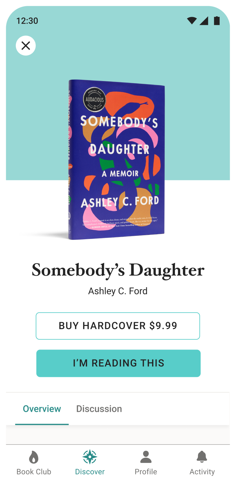
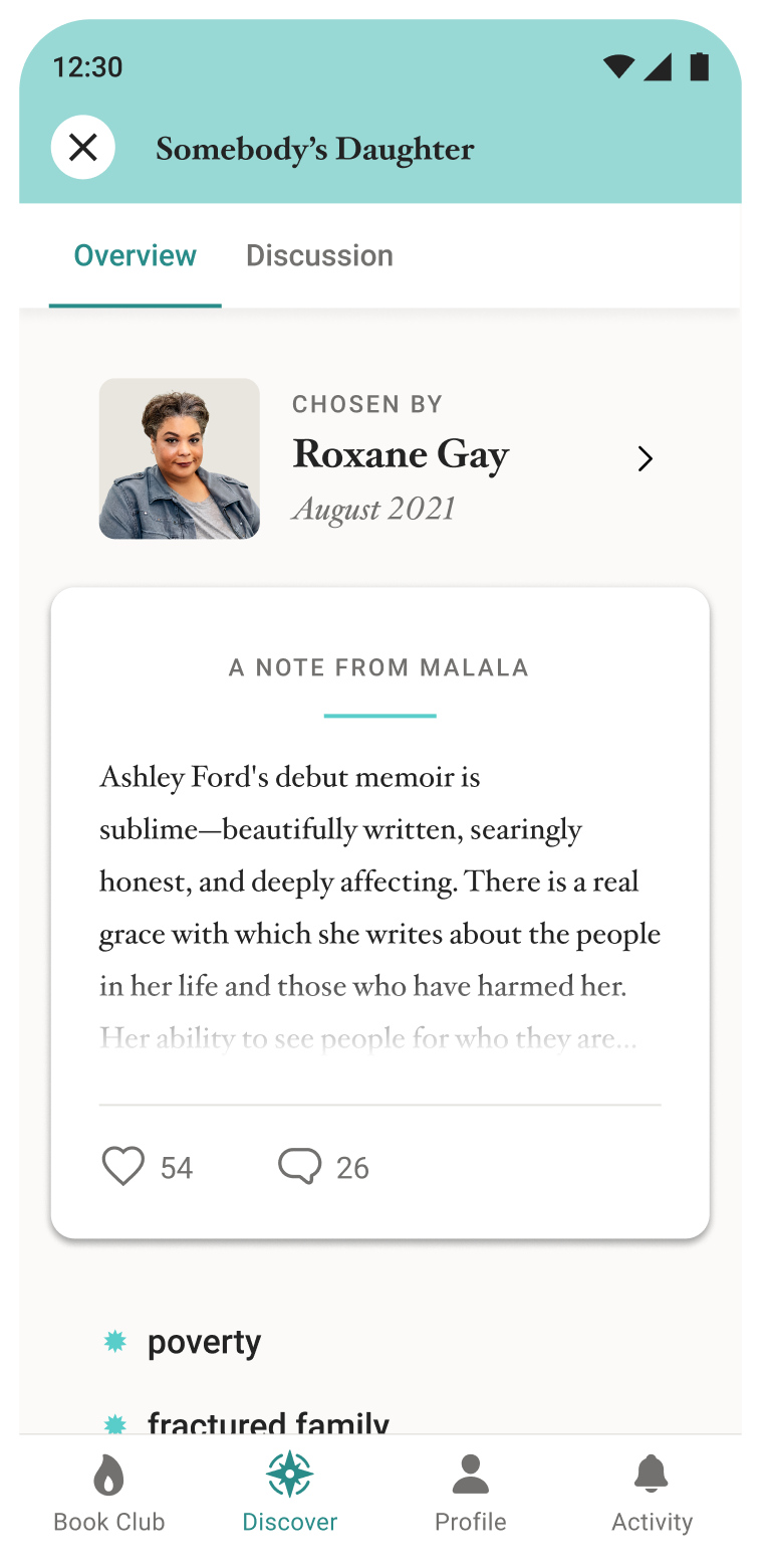
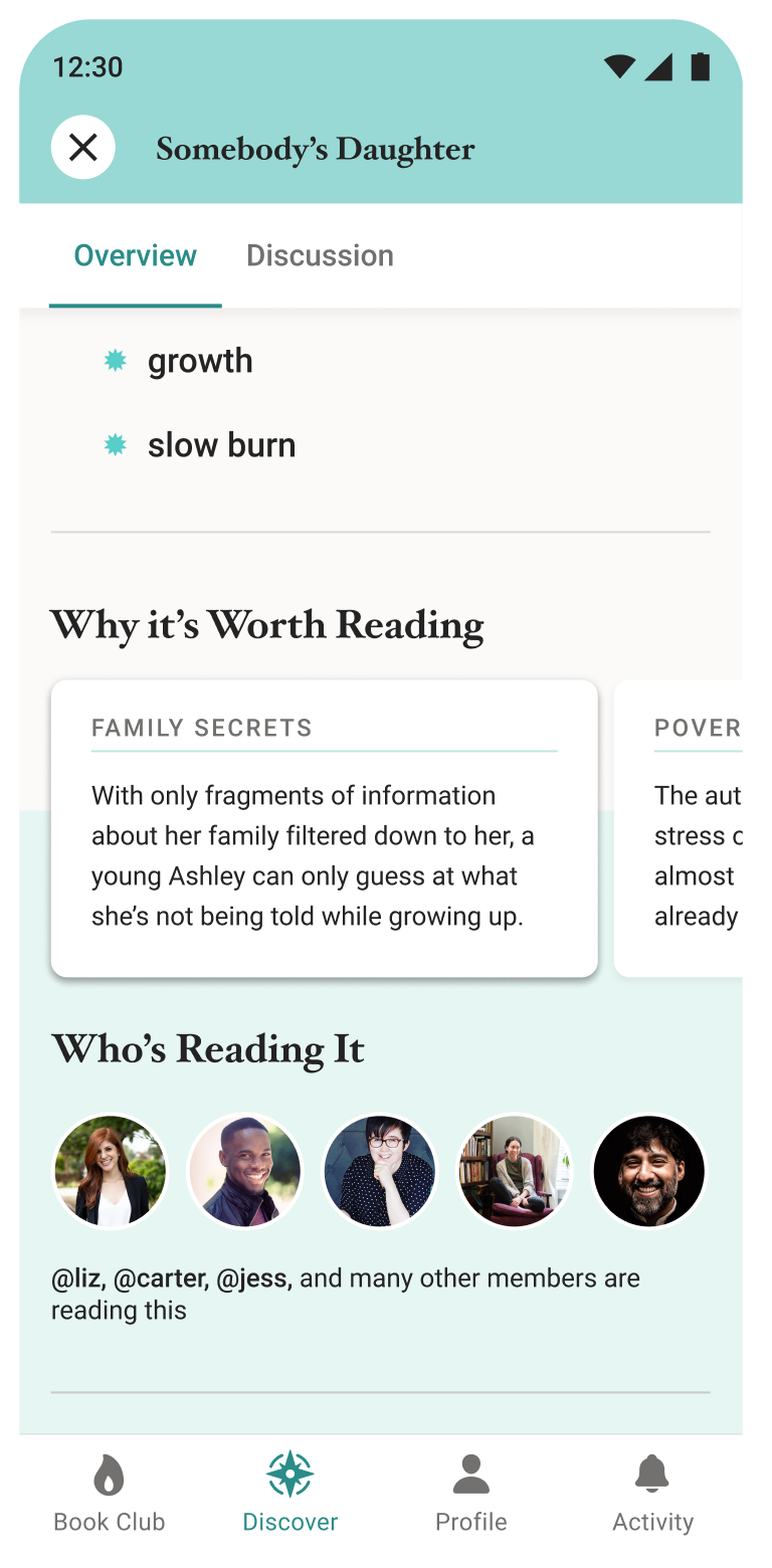
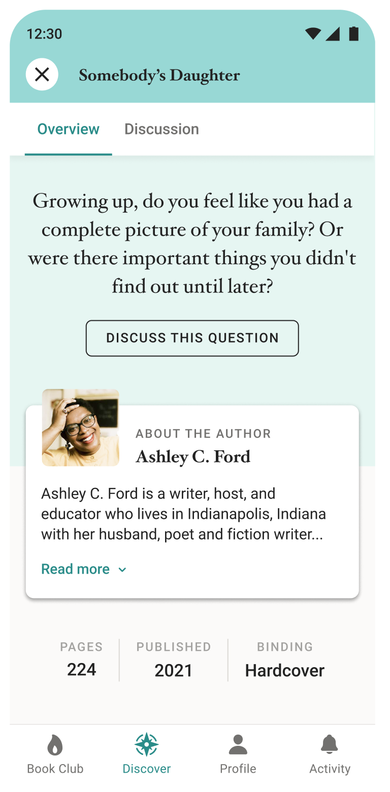
Not long after launching the Litearti app we discovered that, while people were enjoying their specific clubs, they wanted to see what other clubs were reading and get a better idea of what those books were about. They also wanted more information on their own upcoming book picks to see if it was something they truly wanted to read, or if they would like to switch clubs before the cut-off date. To meet the users needs, we introduced a book detail view with a twist.
The carefully curated are books being read by entire clubs, therefore we didn't want to go the traditional route of showing typical details about a book. Instead of focusing on basic descriptions, we included a note by the club leader about why it was picked, detailing the inspiration and personal connection to the story for the club's themes. We also included "why it's worth reading", describing how the book's themes overlap with those of the clubs. Then close out the section with social components to inspire readers to connect with other members of the club, and prompt them to join the discussion by asking an intriguing question.
q
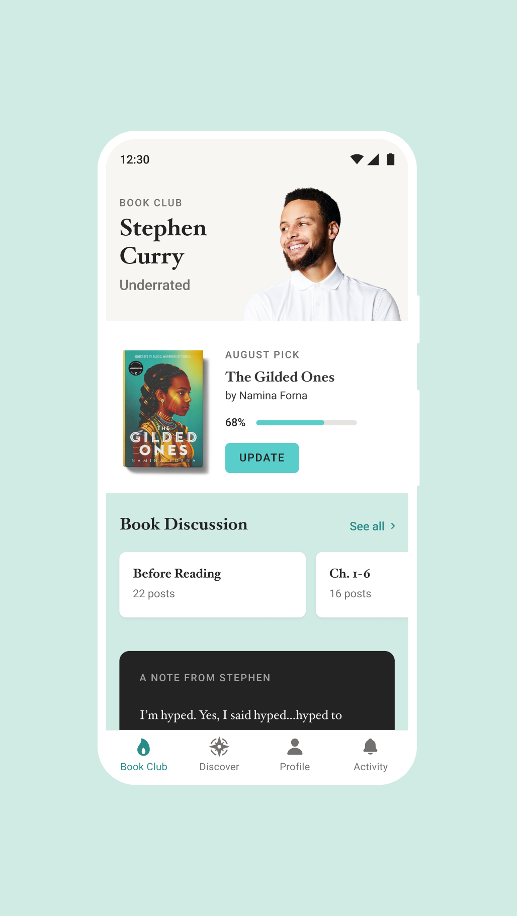
Keep track of your reading progress on your Club page and quickly join the discussion. Jump into chapter discussions. Make sure to avoid spoilers.
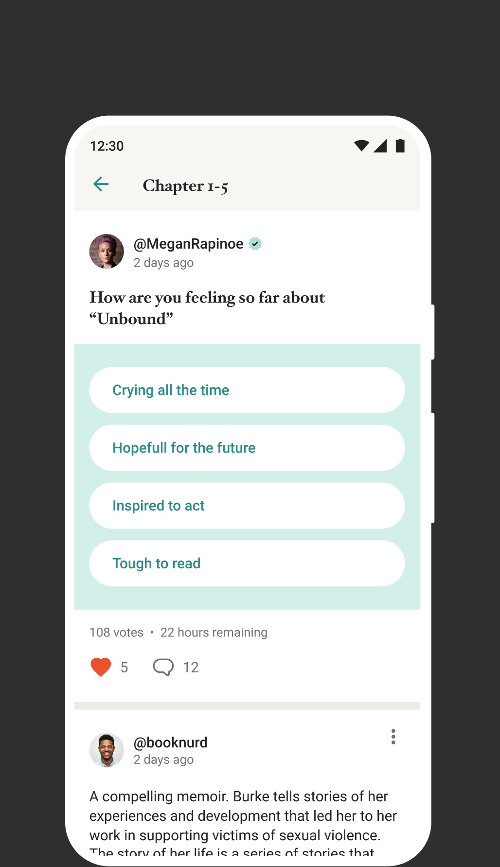
Create different post types, including polls. Gauge reader sentiment about a book, chapter, character or particular passage.
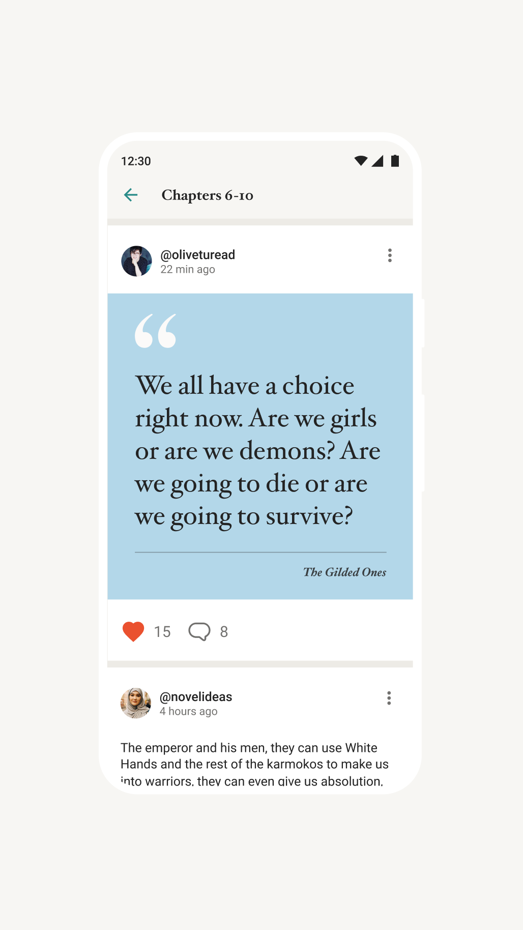
Emphasize quote posts to add impact. Dynamically size the text programatically to accommodate quotes of varying length.
q
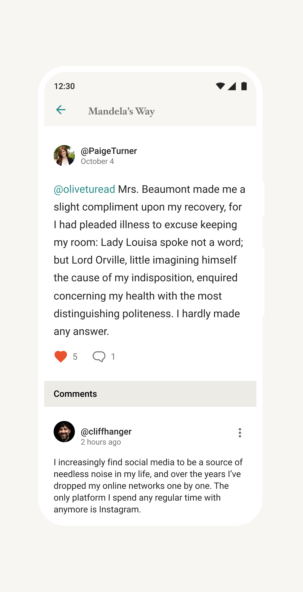
What's a book club without discussions? The core of the club experience is discussing what you are reading with your fellow members.
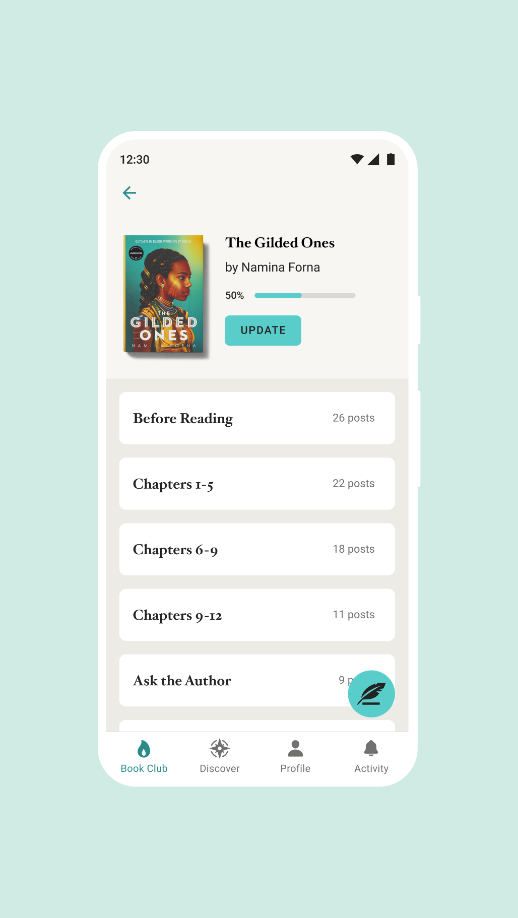
Using the book discussion panel, see how many posts are in individual chapter sections and quickly jump into those conversations.

|
Emoji How You Feel
One of the things we regularly heard from users is that they want more expressive ways than a “Like” to respond to the variety of club posts. The myriad of emotions one experiences when reading a book are endless. From joy, to surprise, to shock and sorrow. The type of people to express these emotions are just as abundant, however not all want to interact with the club in the same way. Some users love adding comments and joining the conversation, while others prefer a more passive experience.
To accommodate the latter, we introduced emoji reactions to give users more ways to interact with the clubs and to express themselves. By understanding the types of reactions users want to use and researching and designing endless variations of emoji styles and iconography, we settled on a set of 6 emojis. The combination of facial expressions and simple icons that represent emotional responses serve to give more users ways to engage with the community and more ways for the platform to gather data about what the clubs are reading and their sentiment about what other members are posting.
Stories in Motion
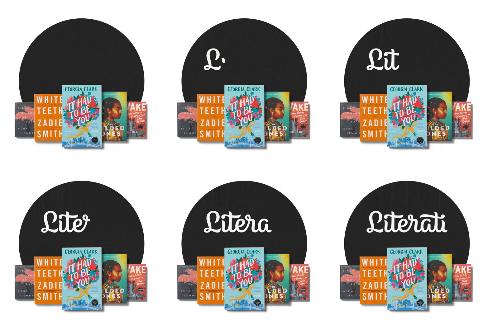
Motion is an essential part of the language that designers use to communicate with users. It is used to describe spatial relationships between states and functionality of individual elements. Being one of the few designers on the team with motion graphics experience I was continually looking for ways to enhance the UI by adding thoughtful motion to enhance the user’s experience. The opportunities are abundant to include motion for screen transitions, micro interactions, and even brand elements. Motion sometimes takes a backseat to the core design implementation but by thinking about motion early and integrating it concurrently in the dev cycle can elevate the stories design tells and create a more natural experience.
Wireframing Efficiency
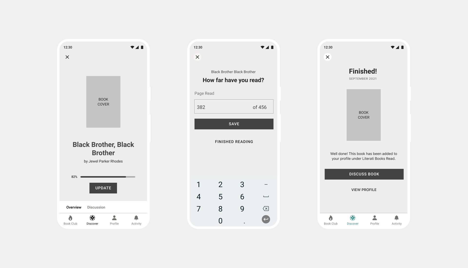
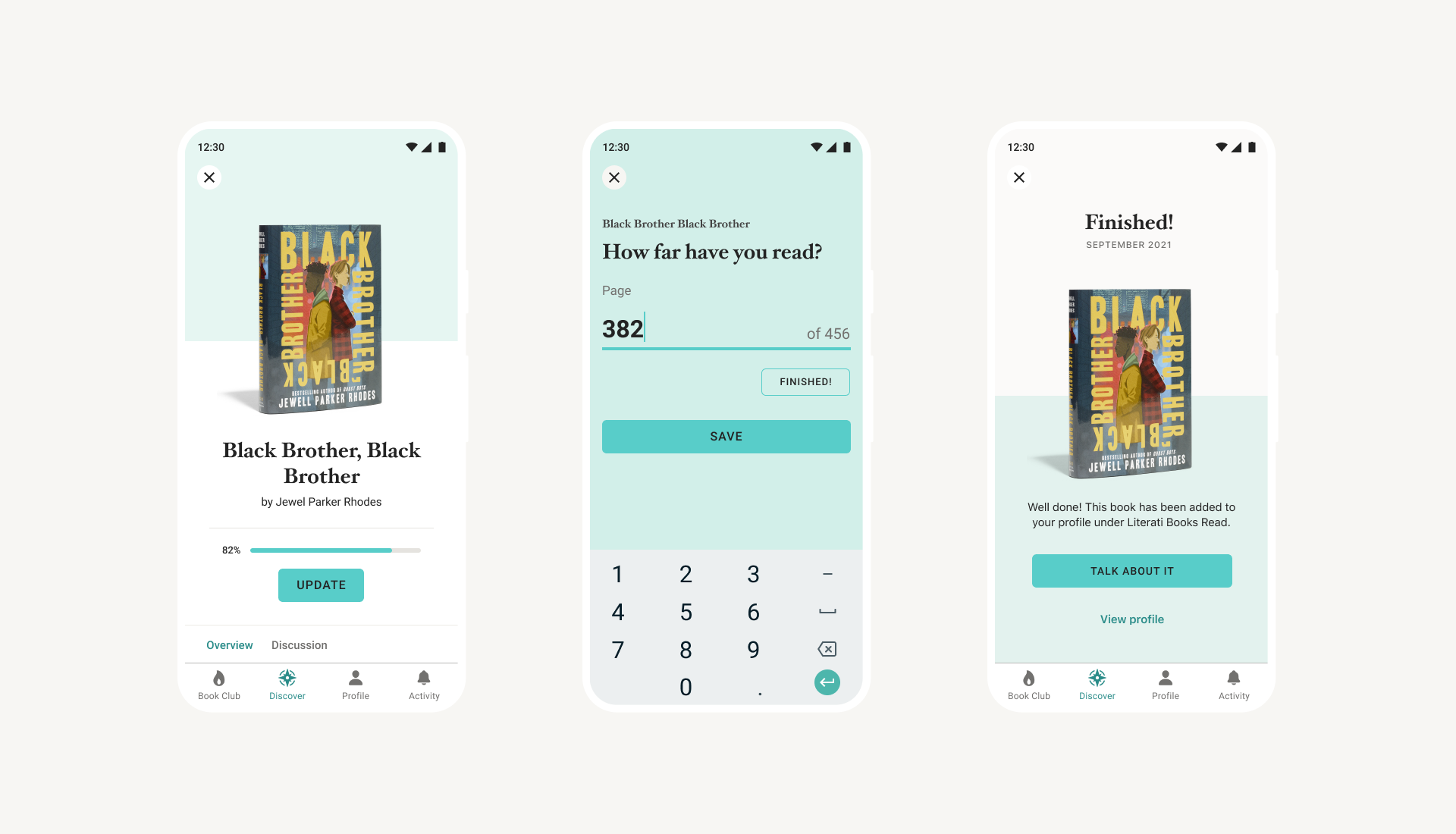
While designing new features, it's important to identify usability issues early on. A sizeable percentage of my time was spent on creating wirefames. A lot of the time on paper and sometimes in Figma. Wireframes are the skeleton of any web or application interface and are an efficient way of focusing on usability patterns while reviewing ideas with the team. Using wireframes, we were able to get feedback and identify flaws and address them in the next round of revisions. They are a quick way of identifying how screens connect together, and individual pieces are structured without getting distracted by colors, images or graphics. Mapping out the functionality early reduced the amount of back and forth that comes after handing off designs and gives developers a clear understanding of how everything will work before they started implementing the designs.

Remote Testing
To quickly get feedback on new features, user flows, and to test our prototypes, Literati used the remote testing platform usertesting.com. Everyone on the design team was encouraged to utilize the service more organically to validate design decisions on the fly. We would use templates to create tests and get feedback with real users within days, sometimes hours. Testers would give direct feedback through video and written answers at key touchpoints during the particular tests. We were able to quickly identify usability problems, test copy, discover insights and gauge user sentiment at various junctures throughout the experience. This allowed us to make design revisions as we worked to assure that what we developed would meet user needs and exceed their expectations.

Hello Darkness My Old Friend
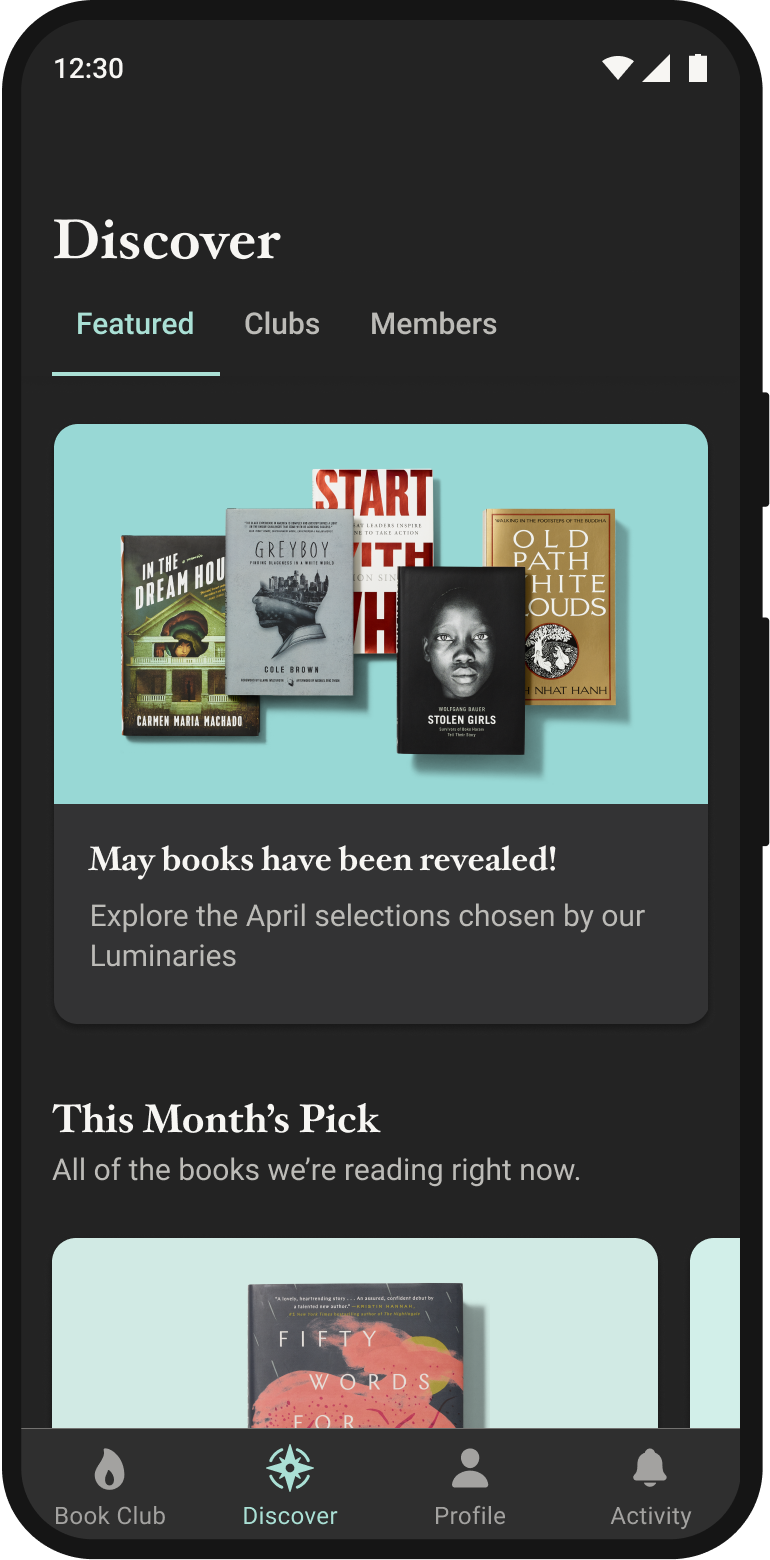
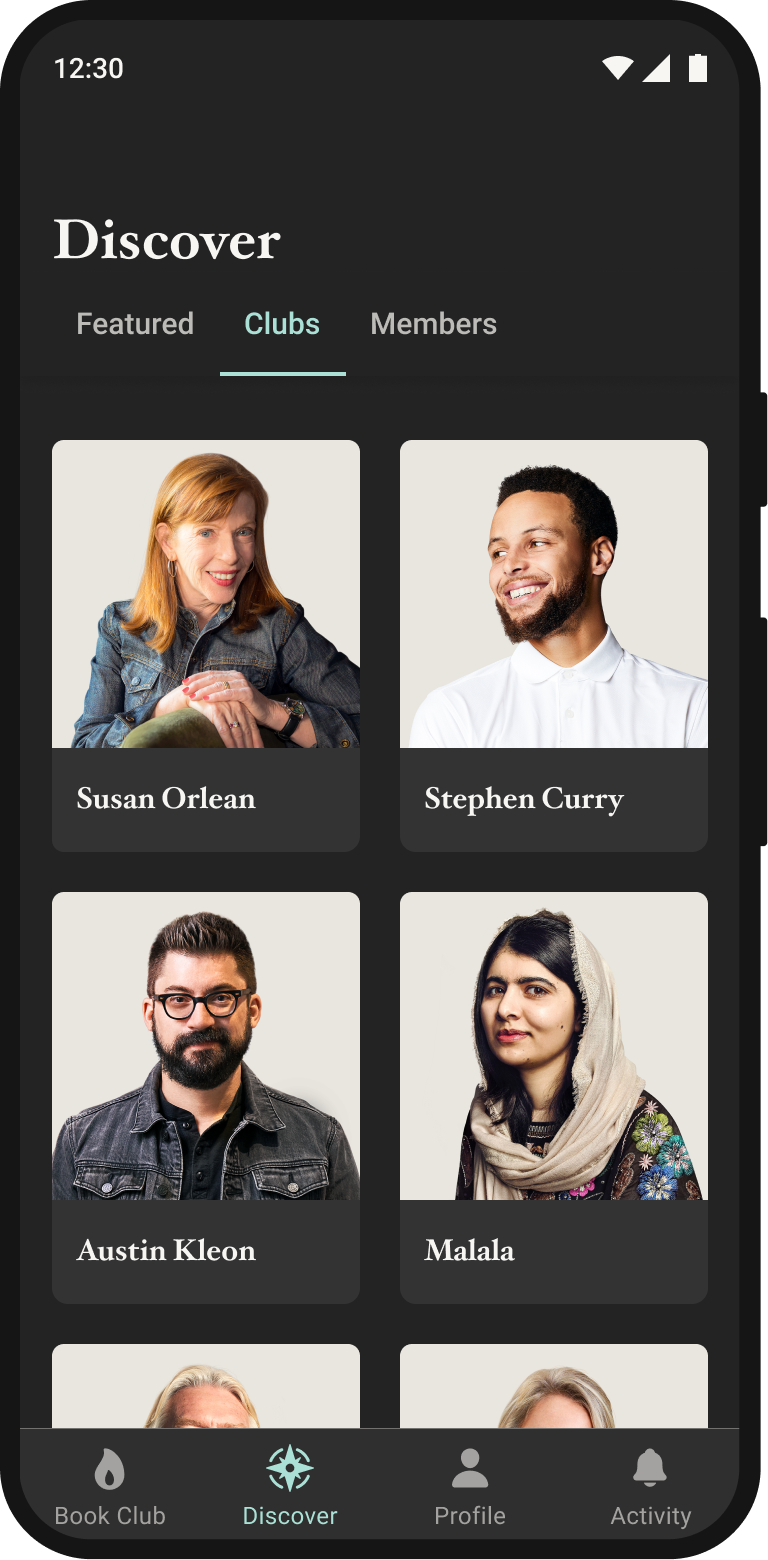
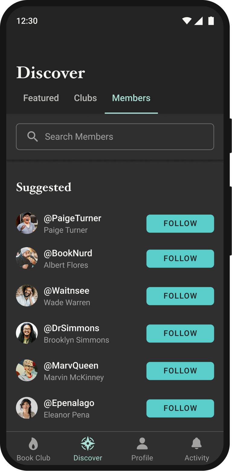
Dark UI is no longer just a mode. It's becoming a requirement for modern digital applications. For an app that is utilized for media consumption and reading, this is even more important. Apps with light and dark versions not only save the user's battery life, they make consuming content in dark environments much more comfortable, which has a positive impact on the user's overall experience. For Literati, we supported switching between light and dark UI from the initial release of the application. To accomplish this we created a color palette for light and dark versions of the designs by adjusting the color and contrast of all the colors to be used in dark mode. Instead of simply reversing colors, we avoided pure black and white, and used hues of gray with a hint of color to create more rich tones. We also ensured that all contrast ratios met or exceeded minimum requirements for accessibility. We took care to review and rigorously test designs in both environments and made individual customizations on a per-screen basis when the color selections did not meet our expectations.
TonyMDesign
TonyMDesign
© 2024
© 2018
Austin, TX
Austin, TX