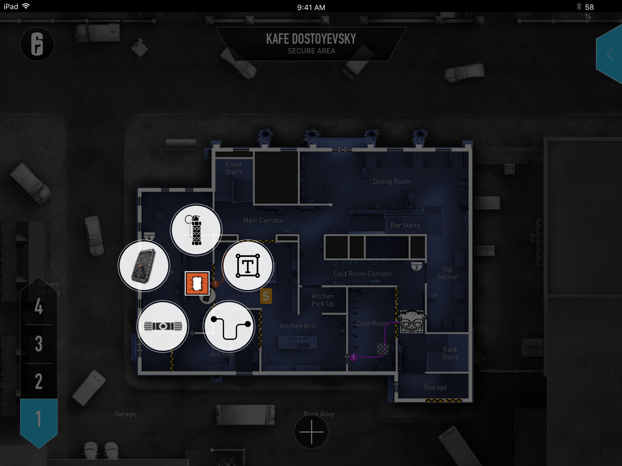
I'm a huge fan of the online shooter Rainbow 6 Siege. I have not been as obsessed with a shooter like this since Unreal Tournament or Call of Duty 4 (the good one). Their online strategy planner is a horrible experience so I redesigned it using a much more intuitive touch interface.
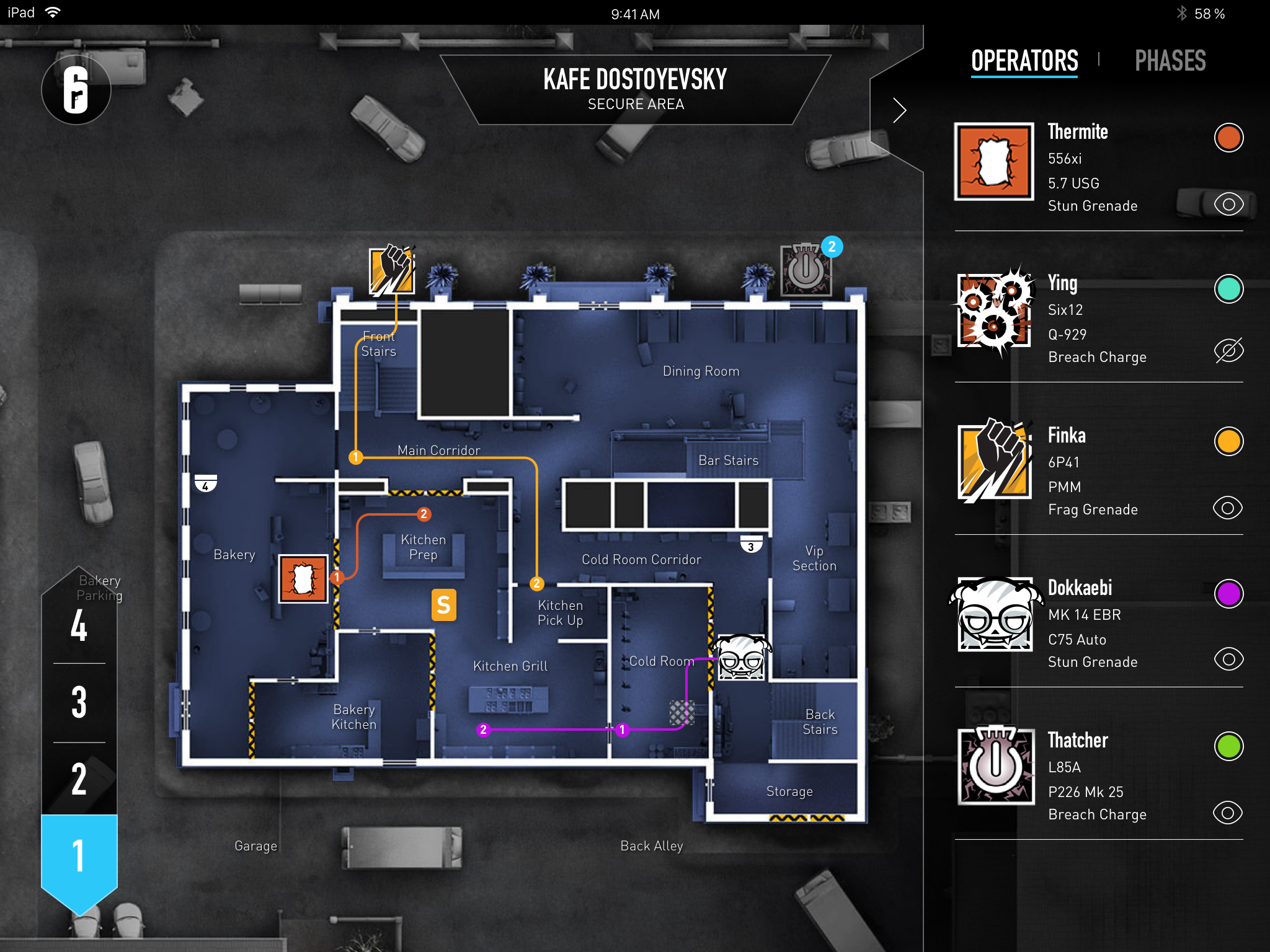
Using a touch device teams can use the application to plan specific strategies on all the maps using all the operators. They can select offense, defense and the type of game mode with their respective objective location. They can then build out tactics to try when playing the game. Communication is key in Rainbow 6 Siege and in order to be successful squad members need to understand their individual roles and what their teammates are planning to do in order to coordinate and secure the objective.
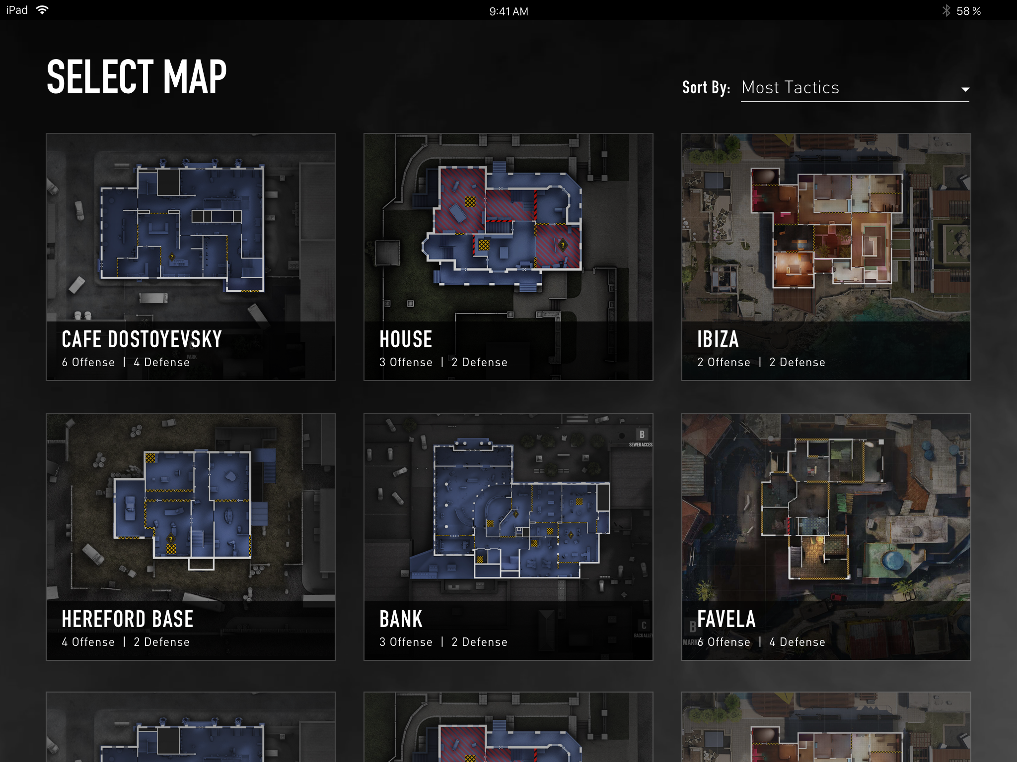
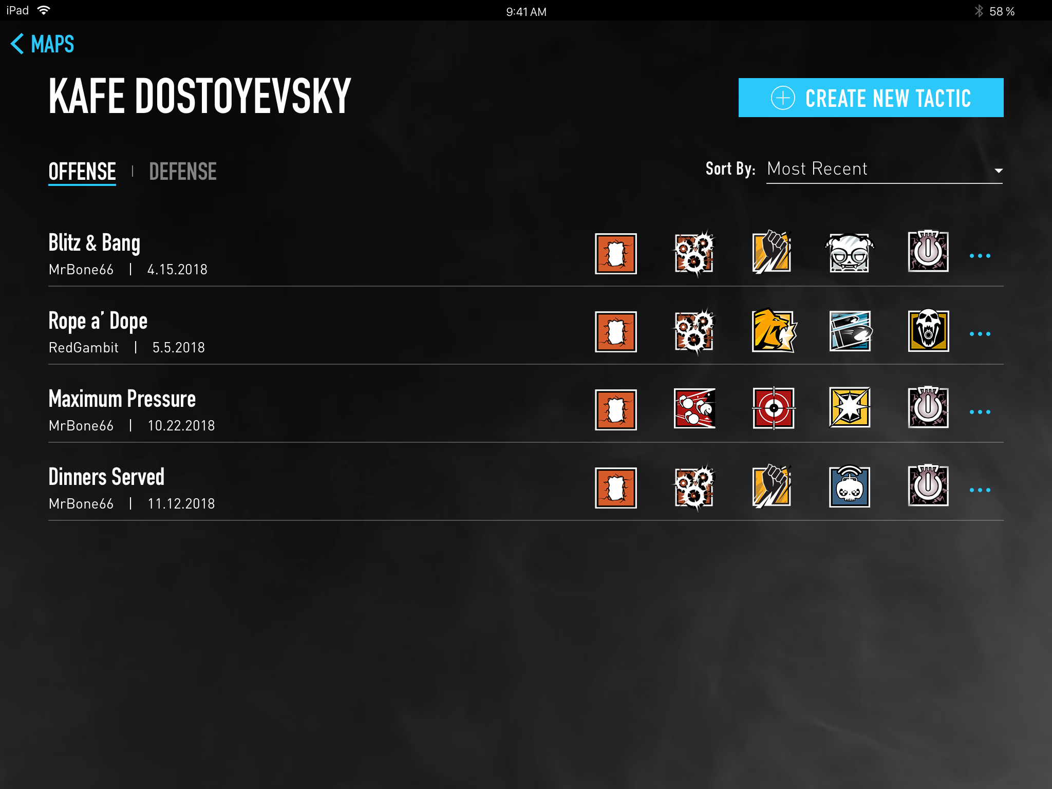
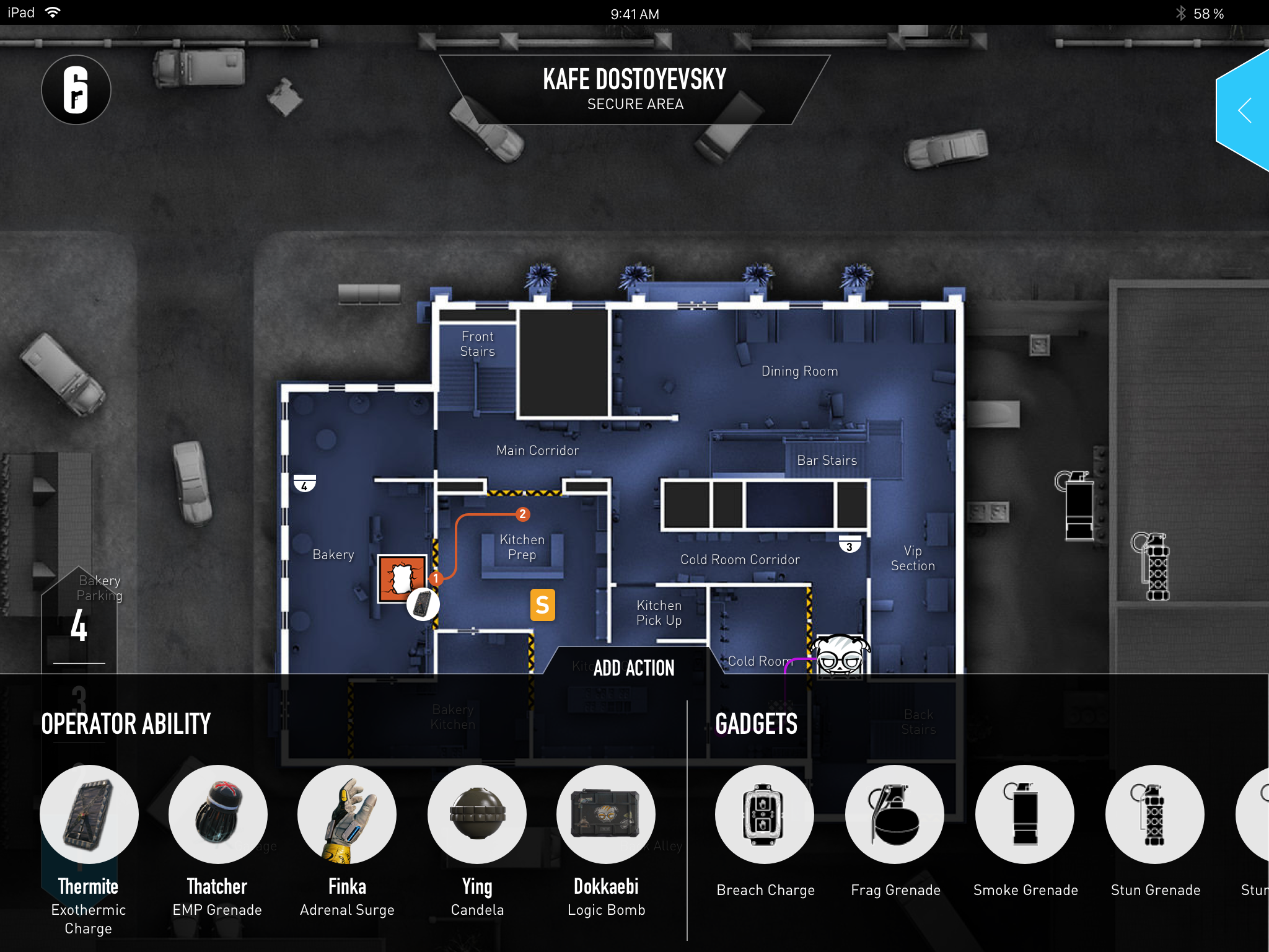
After selecting a map the user can add operators with their specific gear loadout. This then limits the customization options available to place on the map. Teams can then collaborate in real time adding operator specific actions or include overall tactics and make suggestions using various gadgets.
